Sunday, 7 July 2013

Room Requirements

Library, computer labs and toilet block

Studio Spaces with outdoor seating area and an adjacent common room for students, lecture theatre
 

Cafeteria with above seating area, another toilet block and offices for staff with an adjacent staff meeting room
 
Gallery with stairs to Deans office in centre of school


Folly at base of valley

Simplicity and Traditionalism in Design


The shape of a building or object should be primarily based upon its intended function or purpose and revert back to basics.  The shape and organization of a building should be determined only by functional requirements and primitive design, instead of by traditional aesthetic concepts. Functionality and refreshing nakedness looks honest and is an inevitable design concept. Buildings could be spare and crisp in their principal masses, often punctuating plain surfaces with eruptions of lush, while influenced by cardinal directions. Concrete tangible forms consisting of many chambers on different levels borrows visual forms from non-Western or prehistoric peoples, such as Mesoamerica design. Primitive design has been important to the development of modern architecture, creating urban monumental buildings and structures where form follows function.

5 Fraps images of Environment


The images highlight the aesthetic of being true to the terrain and following cascading plan with different levels created by mostly rectangular components stacked upon each other. Seemingly simplistic in nature the architecture of the bridge was influenced by the Mesoamerican naturalistic and primitive design in their artworks and ancient architecture, while continuing with a functional pattern. Thus the school was created with an influence on circulation, using the stairs and levels as an important feature in the creation.

FINAL SUBMISSION: Experiment 3


YouTube Clip

Draft Images of Evironment


18 Sketch Perspectives


36 custom textures


Sunday, 5 May 2013

FINAL SUBMISSION


5 Fraps images of Monument

This view shows the integration of the monument into the environment. Scarpa was known for building around his context and I made his section of the monument to reflect this by seeming to disappear into a cliff. The shot also shows much of the detailing I incorporated both to connect both monuments and to highlight Ito's design aesthetic, allowing maximum light in the one enclosed space and blurring the boundaries of the internal and external environment.
 
View showing roof detailing to allow light in and interesting shadow patterns


The view from the other side of the monument shows more stairs and the ramp to highlight the ability for a person to move within the monument from space to space. It also shows the roof detailing and its ability to project interesting shadow patterns along the cliff face. The use of my textures is apparent in this shot, demonstrating the cohesiveness between each side of the monument 


This is a nighttime view of the monument with ambient light creating interesting shadows and patterns coming from the detailing. It also allows people to move throughout the monument at all times as the pathways are illuminated as is the monument within the environment.


View emphasizing the importance of detailing in the work and its ability to create interesting shadow effects. It also shows the use of my linking texture.

Final textures used in monument


DARK:

I used this texture mainly in Carlos Scarpa's section in order to highlight his use of circles and regular geometric shapes in his work. I put it on the top of the two pillars in Ito's work as well to tie in the two monuments and explore the interconnectedness through their bodies of work


 MEDIUM:

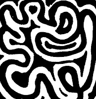
This free flowing form of a textures was used in Ito's monument along the wall containing circles to show his aesthetic of illusion and his use of light and dark to define his spaces.


LIGHT:

I used this texture on the pathways between the two monuments as it represents both the structural patterns and straight lines of Scarpa's body of work as well as the more free flowing curves of Ito's work.

36 custom textures


I did a variety of different style textures to incorporate different design aesthetics utilized by each architect.
Carlos scarpa is very famous for his detailing and use of geometric shapes in his buildings. Therefore the first three play homage to his use of circular shapes and straight lines in his work.
Toyo Ito is different in his more illusionary work where he uses a lot of curves as well as line when creating his buildings. Thus the 4th texture set highlight the variety of shape he uses, while the 5th shows a collaboration of both styles and finally the 6th set show his more free flowing aesthetic with curves.

Final Concept

I decided to go ahead with this parallel projection and develop into a monument due to its feeling of movement throughout the space and the advantage it gave me in adding detailing and different structural elements. Therefore, the final electroliquid aggregation of concepts I am going ahead with is:
 
"The use of detailing to create movement from space to space and level to level"

This concept will inspire my alterations to the model on google sketchup.

6 Parallel projections


Combination of detailing and relationship between interior and exterior


Combination of negative space and simple geometry


Combination of floating and reflection