Sunday, 5 May 2013
5 Fraps images of Monument
 |
| View showing roof detailing to allow light in and interesting shadow patterns |
Final textures used in monument
DARK:
I used this texture mainly in Carlos Scarpa's section in order to highlight his use of circles and regular geometric shapes in his work. I put it on the top of the two pillars in Ito's work as well to tie in the two monuments and explore the interconnectedness through their bodies of work

MEDIUM:
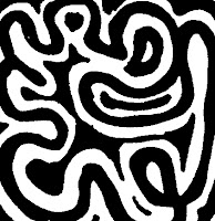
This free flowing form of a textures was used in Ito's monument along the wall containing circles to show his aesthetic of illusion and his use of light and dark to define his spaces.
LIGHT:
I used this texture on the pathways between the two monuments as it represents both the structural patterns and straight lines of Scarpa's body of work as well as the more free flowing curves of Ito's work.
36 custom textures
I did a variety of different style textures to incorporate different design aesthetics utilized by each architect.
Carlos scarpa is very famous for his detailing and use of geometric shapes in his buildings. Therefore the first three play homage to his use of circular shapes and straight lines in his work.
Toyo Ito is different in his more illusionary work where he uses a lot of curves as well as line when creating his buildings. Thus the 4th texture set highlight the variety of shape he uses, while the 5th shows a collaboration of both styles and finally the 6th set show his more free flowing aesthetic with curves.
Final Concept
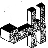
I decided to go ahead with this parallel projection and develop into a monument due to its feeling of movement throughout the space and the advantage it gave me in adding detailing and different structural elements. Therefore, the final electroliquid aggregation of concepts I am going ahead with is:
This concept will inspire my alterations to the model on google sketchup.
"The use of detailing to create movement from space to space and level to level"
This concept will inspire my alterations to the model on google sketchup.
6 Parallel projections
12 Axonometrics
6 Concepts used:
Toyo Ito
1. Negative space
2. The relationship between interior and exterior/ transparency and light
3. Floating
Carlos Scarpa
1. Simple geometry/subtraction
2. Reflection
3. Detailing
Subscribe to:
Comments (Atom)


